Sunday, 21 August 2011

Lee Kah Yee - Accommodation


Description on the individual ideation
The idea of designing this page is to let the readers know more about The Tree Top Walk in Kedah. In my opinion, everyone sure having headache during choosing the trip place and the accommodation. Hence, the readers can get more information about The Tree Top Walk through this website.


Objective
The objective of this link is to let the people in all around the world more understand the accommodation for The Tree Top Walk in Kedah. In this page, I will provide the flash video for the picture so the readers know where and what type of room they would like to stay.


GUI Design


This is the initial GUI Design for Stresschicky website. The most top is our banner and logo. We will create a logo and banner for our website. Below the logo+banner is Navigation Bar. It contains the links for our website, such as Home, Introduction, Activities, Accommodation, Direction, Peoples' View, and Contact Information. Each button represent different links and each links will be design by each of the group mate. So every page will show different design style and different information.


The picture on the above is my individual side page(Accommodation). When the readers click the Accommodation page, this layout will come out. After the readers clicked this page, the left side have another 3buttons such as Information, Type of accommodation&Galleries and Contact Information for the accommodation.
* For example, when the reader click Type of Accommodation&Galleries button, the content will show texts, pictures and flash video to readers.


Flow chart

This is the Flow Chart for the Accommodation page. I will brief about the information for the Tree Top Walk, show you the type of accommodation&Galleries as well as the contact information for the accommodation. For your information, I will use Adobe Flash to create Gallery images for the accommodation that nearby the Tree Top Walk.


Reference


Wednesday, 20 July 2011

Summary for E-wallpaper FOM Open Day =D


Hi everyone,
Once again, Welcome to my world ! 


For your Information, FOM Open Day 2012 is on 21st March 2012.
Here is the attachment of the jpeg E-wallpaper.


Pls clicked here -->   A little info about m3 ♥    in order to know more about me ! ^^


Here I listed all the link which follow to the sequences how i did this wallpaper.

HERE WE GO ~~~~ 

1) Raw material ♥
2) First Part of E-wallpaper ♥
3) Second Part of E-wallpaper ♥
4) Third Part of E-wallpaper ♥
5) Final Part of E-wallpaper ♥

Regards, 
KahYee  

The Raw Materials

Good Morning ~
^^

I'm here to explain which materials i have been used to create E-wallpaper of FOM OPEN DAY.


1) MMU Logo


2) Background


3) Colourful Sky


4) Butterfly


5) Sweet


6) CR


7) FOM Cafe


8) FOM Management


9) XR0001

Final part -- E-wallpaper of FOM OPEN DAY


Helloooo everyone !
Come come come ~
I'm going to continue to edit my last post's production again..
=X


- insert image -
File > Open > XR 0001
Then, i used Rectangular Marquee Tool to select whole image.
Ctrl C (for copy purpose) the selected area.


Open back the E-wallpaper tab.
Ctrl V (for paste purpose) the selected area.
After that, I resized & rotate it.
Edit > Transform > Scale
Edit > Transform > Rotate


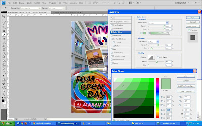
Next, I double click the XR0001 layer, the Layer Style box will pop out.
I ticked the Outer Glow box and make some adjustment.
Opacity : 100%
Noise : 100%
* change the Gradient colour
Spread : 59%
Size : 32px
Range : 52%


Besides that, I also ticked the Inner Glow box to make the image more attractive.


Furthermore, I ticked the Stroke box and clicked OK.


Again, I repeated the steps.
File > Open > FOM Cafe
Then, i used Rectangular Marquee Tool to select whole image.
Ctrl C (for copy purpose) the selected area.


Open back the E-wallpaper tab.
Ctrl V (for paste purpose) the selected area.
After that, I resized & rotate it.
Edit > Transform > Scale
Edit > Transform > Rotate

Then, I double click the FOM Cafe layer, the Layer Style box will pop out.
I ticked the Drop Shadow box as well as the Outer Glow box .


- adjustment -
Blend Mode : Pin Light
Opacity : 100%
Noise : 100%
* change the Gradient colour
Spread : 8%
Size : 38px
Range : 52%
Contour : Ring


Moreover, I ticked the Stroke box and adjusted the Structure Size to 3px then clicked OK.


Yet, insert another image again.
File > Open > FOM Management

Then, i used Rectangular Marquee Tool to select whole image.
Ctrl C (for copy purpose) the selected area.


Open back the E-wallpaper tab.
Ctrl V (for paste purpose) the selected area.
After that, I resized & rotate it.
Edit > Transform > Scale
Edit > Transform > Rotate


Then, I double click the FOM Management layer, the Layer Style box will pop out.
I ticked the Outer Glow box and make some adjustment.
Opacity : 100%
Noise : 100%
* change the Gradient colour
Spread : 41%
Size : 40px


I also ticked the Inner Glow box and adjusted the Elements Size to 90px..


Lastly, I ticked the Stroke box and adjust the Structure Size to 3px then clicked OK.


Again, do the same steps,
File > Open > CR
Then, i used Rectangular Marquee Tool to select whole image.
Ctrl C (for copy purpose) the selected area.


Open back the E-wallpaper tab.
Ctrl V (for paste purpose) the selected area.
After that, I resized & rotate it.
Edit > Transform > Scale
Edit > Transform > Rotate

Then, I double click the CR layer, the Layer Style box will pop out.
I ticked the Outer Glow box and make some adjustment.
Blend Mode : Darken
Opacity : 100%
Noise : 100%
* change the Gradient colour
Spread : 49%
Size : 38px


I also ticked the Inner Glow box and adjusted the Elements Size to 125px..


Last but not least,  I ticked the Stroke box and adjusted the Structure Size to 7px then clicked OK.


That's all for the image editing~
Now we proceed to the last 2steps, which are editing the Sweet layer and the background effect.

(i) Sweet layer
- double clicked the Sweet layer
- the Layer Style box will pop out
- General Blending > Opacity > 78%
- clicked OK


** The reason i change the Opacity from 100% to 78% is because I want to make the Sweet to be more transparency so our eye attension can more focus on both MMU and FOM Open Days' words.


(ii) Background layer
- Filter > Sketch > Water Paper


* change the element size
- Fiber Length : 15
- Brightness : 60
- Contrast : 74
- clicked OK


Da Da Da Dang !!!
Finally, the final psd E-wallpaper is ready ~


=)

Regards,
KahYee 


Third part -- E-wallpaper of FOM Open Day


Harlloooooo !
The picture below is my last post's production..


Let's continue!! ^^

First of all, i open the Sweet picture.
File > Open > Sweet


Now, I gonna cut part of the sweet and paste onto the E-wallpaper in last post.
same as previous, I used Rectangular Marquee Tool to select it.


Ctrl C > E-wallpaper tab > Ctrl V


then, I resize the Sweet and move to the left bottom size.
Edit > Transform > Scale


Next, I write FOM OPEN DAY by using the Horizontal Type Tool.
and changed the size of the words to 80px.


Same as previous, I double click the FOM OPEN DAY layer then it will automatically pop out the Layer Style box.
Then, I ticked the Drop Shadow.

The below is the Structure:
Blend Mode : Multiply
Opacity : 75%
Distance : 38px
Spread : 32%
Size : 43%


Besides that, I also ticked the Outer Glow box.
I changed the Gradient Editor's colour and also changed the Elements.
Spread : 43%
Size : 9px


Yet, don't forget to change the Quality as well..
Contour > Rolling Slope


On top of that, I would like to add the date for FOM OPEN DAY in MMU.
again, I write 21 March 2012 by using the Horizontal Type Tool.
and change the size of the words to 45px.


In my opinion, pink colour can make everything more attactive.
so I change the Date to pink colour :)


Double click the 21 March 2012 Layer, it will pop out the Layer Style box.
I ticked the Stroke box and changed the Size to 103px.


Furthermore, I ticked the Outer Glow box as well.
Then, I changed the Gradient Editor colour.
at the Quality there, I changed the Contour to Ring - Double to make the outer layer of the words look more attractive.


Last but not least, I ticked the Inner Glow box.
Don't change anything except the Element (Choke & Size)
Choke : 2%
Size : 29px


the image below is after edit all of the words =D


Now, I would like to cut the unwanted blue part of the Sweet layer.
I used Polygonal Lasso Tool to draw the unwanted area.


after selected the unwanted blue area, press Ctrl X (for cut purpose).


then, used the Blur Tool to blur the rest blue part.


- adjustment -
Master Diameter : 101px
Hardness : 100%


This is my Final Image for my 3rd part..


=)

Regards,
KahYee